Company:
Ethlas
Deliverable:
Product Suite Dashboard
Role:
Founding Product Designer (UX Strategy, Research, Visual Design)
Timeframe:
3 Months
Overview
Designing a centralised dashboard to bring FailSafe’s security tools together in one sleek, unified platform — think Adobe Suite, but for Web3 cybersecurity.
Light/dark modes, dev docs, consistent UX, and fully on-brand design.
Gave BD a solid demo asset, helped land new clients, improved cross-sell, and got internal teams aligned on how current (and future) products should look, feel, and function — plus the bonus of tighter collaboration and faster design/dev turnaround.
The Problem
FailSafe had three powerful products — Interceptor, Guard, and Radar — each tackling different aspects of Web3 security. But here’s the gap:
There was no unified way to present FailSafe’s offerings as part of a larger ecosystem.
Clients saw each product in isolation.
BD team struggled to cross-sell or explain the bigger picture.
Inconsistent design and branding for each product.
Scattered docs, SDKs, and client resources.
The Fix
I proposed and led the design of a centralised dashboard — a single source of truth for everything FailSafe, which delivered:
A hub to showcase product, features, tools, and updates.
Consistent visual identity across all offerings.
One-click access to dev tools, docs, and product blogs.
Structured content for both business and technical audiences.
A scalable design system future teams can build from.
Design Approach
01 // Discovery & Research
I studied platforms like Adobe Creative Suite, Jira, and Salesforce to understand:
What makes multi-product dashboards intuitive.
How power users navigate complex ecosystems.
Where existing models fall short — how we could do better.
02 // Design & Build
Key moves:
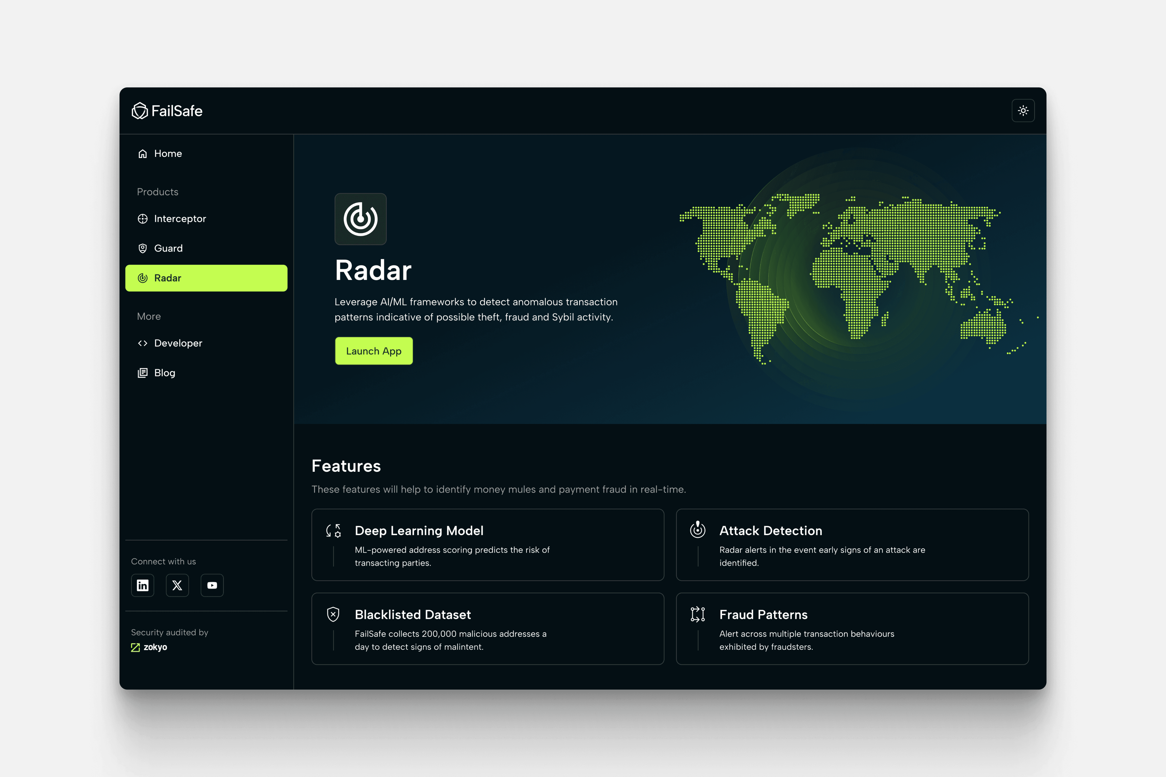
Adopted shadcn/ui for its Tailwind CSS compatibility — plus Engineering was already familiar with it.
Developed an Overview and Tab system to ensure all products were always visible.
Created a simple side navigation, allowing users to explore multiple products without jumping between isolated pages.
Built dedicated product and developer pages tailored to the various client personas (business vs technical users).
Implemented quick-access links to documentation and product blogs to keep clients informed.
Enabled dark/light mode to cater to Web3.0 user preferences.
Created consistent UI components, font styles, and colour palette for brand cohesion.
Leveraged the use of Google Icons for UI familiarity and created custom illustrations for branding flair.
Outcomes & Impact
Accelerated business growth: Cut BD pitch time by 30%, lifted demo-to-close conversion from 13% to 35%, and supported 10 new client wins within the first quarter post-launch. Helped drive cross-sell uptake within the first 6 months — with 70% of single-product users adopting at least 2 products. Contributed to FailSafe’s 2024 ARR goal.
Improved internal alignment and speed: Achieved 90% internal adoption, standardised product execution, and reduced design/dev turnaround for new products from 3 weeks to 1.
Earned industry recognition: Winner of Meet the Drapers Startup Competition 2025 (Silicon Valley, 2025), Finalist at Consensus PitchFest 2024 (CoinDesk, Austin Texas), and awarded Best Digital Asset/Risk Monitoring Service by Regulation Asia 2024.
Design Approach
01 // Discovery & Research
I studied platforms like Adobe Creative Suite, Jira, and Salesforce to understand:
What makes multi-product dashboards intuitive.
How power users navigate complex ecosystems.
Where existing models fall short — how we could do better.
02 // Design & Build
Key moves:
Adopted shadcn/ui for its Tailwind CSS compatibility — plus Engineering was already familiar with it.
Developed an Overview and Tab system to ensure all products were always visible.
Created a simple side navigation, allowing users to explore multiple products without jumping between isolated pages.
Built dedicated product and developer pages tailored to the various client personas (business vs technical users).
Implemented quick-access links to documentation and product blogs to keep clients informed.
Enabled dark/light mode to cater to Web3.0 user preferences.
Created consistent UI components, font styles, and colour palette for brand cohesion.
Leveraged the use of Google Icons for UI familiarity and created custom illustrations for branding flair.
